Matic Magister
Oct 12, 2026

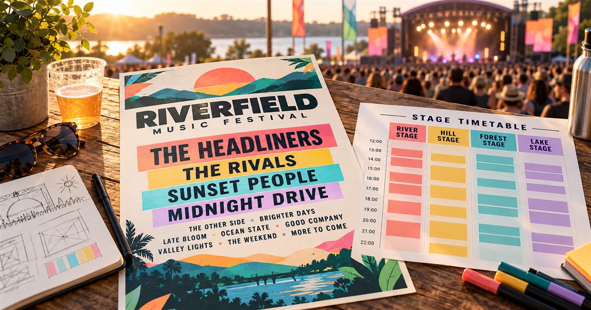

A festival announcement has seconds to persuade someone to stop scrolling. A timetable has a different responsibility: helping that person reach the right stage before the first song. Using one compressed poster for both jobs leaves fans zooming, searching, and guessing. Festival typography works best when the lineup and the running order share accurate information but use different layouts.
For promoters, booking teams, and artist managers, the problem begins before anyone chooses a font. Billing, spelling, dates, and late changes all affect how the music is presented. The following approach builds around those decisions, from the first announcement to the moment a set moves to another stage.
An announcement emphasizes the festival identity and the approved artist hierarchy. A timetable emphasizes day, stage, start time, and end time. These are different reading tasks, even when both materials feature the same performers.
Glastonbury’s official 2025 lineup provides a useful real example: its stage-by-stage listings pair artists with performance times. A fan planning a route needs that structure, not just the names on the announcement poster. The design lesson is straightforward: preserve an attractive overview, then offer a dedicated schedule that answers where and when.
Viberate’s festival coverage addresses lineup analysis and event research. Those tools can inform booking discussions; they do not establish an artist’s agreed billing. Treat streaming ranks and promotional prominence as separate decisions.
Collect approved artist names, billing groups, permitted logos, day assignments, and any placement requirements in one lineup record. Ask the booking team to settle unresolved positions before the designer builds a hierarchy. Otherwise, a small visual adjustment can become an approval dispute.
Imagine two fictional co-headliners: Aster and The Midnight Assembly. If every name must occupy one line, shrinking the longer name may make equal billing look unequal. Test a two-line treatment, a wider text area, or a genuine condensed style. Obtain approval for the treatment instead of silently squeezing the artwork horizontally.
A specimen containing the festival name tells you little about a mixed lineup. Test the longest names and the most demanding characters before purchasing. Real artist names such as Björk and RÜFÜS DU SOL make useful spelling checks: the accents are part of the name, not optional decoration. This is a character-coverage example, not a claim that either artist is booked for a particular event.
Check punctuation in collaborations, ampersands, numerals, and the distinction between a solo artist and a back-to-back set. Avoid a decorative separator that looks like part of someone’s name. On mobile schedules, keep names as searchable text where possible rather than making an image the only source of information.
For the font shortlist, test these items:
· The longest artist name at the smallest planned display size.
· Accents and punctuation in every confirmed name.
· Start and end times beside stage names.
· A replacement announcement with substantially longer wording.
Keep stage names and time formats consistent across the site, printed schedule, and social updates. A 24-hour format can avoid AM/PM confusion, but after-midnight sets still need an explicit day convention. If the festival labels a 00:30 set as part of Friday night, explain that convention and apply it everywhere.
Use color as a secondary stage cue. Repeat the stage name in words so the schedule remains understandable in grayscale or when colors are difficult to distinguish. Reserve enough space for changes; a tightly packed timetable is fragile when a set starts fifteen minutes later.
A useful cross-industry example is PetChoy’s customized TT Trailers Bold. In its published case study, TypeType explains that the project added Vietnamese characters and developed both conventional and playful diacritic treatments. The resulting files were named TT Trailers Petchoy and TT Trailers Petchoy Display. This was a pet-food project, not a music commission, but it illustrates why character coverage and decorative expression deserve separate decisions.
The case study describes one technical task as “hinting of new characters.” That short phrase is a reminder that adding attractive letterforms also requires production work. For a festival, custom glyphs must still render correctly in names, printed posters, and digital exports.
If a retail family nearly meets the brief but lacks a required feature, compare the testing and customization options at typetype.org. Bring the full lineup and intended formats to the discussion. A precise list of missing characters or spacing problems is more actionable than a request to make the font feel more musical.
Store the performer, stage, date, start time, and end time in separate fields. Maintain one approved record rather than retyping details into every artwork file. A replacement should trigger a review of the schedule, announcement assets, ticket-page copy, and any downloadable files that remain in circulation.
A festival campaign may involve an agency, freelancers, a web developer, a motion designer, and a print supplier. Decide who needs editable font files and who only needs finished artwork. Font licensing follows the actual use and the relevant agreement; buying a desktop license should not be treated as universal permission.
TypeType lists separate categories for these uses, including desktop, webfont, digital ads, video and broadcasting, and app licenses. Other foundries may bundle rights differently. Ask about the festival logo, merchandise, and future editions as well. Converting text to outlines is an output choice, not a substitute for obtaining the required rights.
A common mistake is exporting the full poster as a tiny mobile image and assuming viewers will zoom. Split it into day-specific panels with repeated festival identification. Another is correcting a misspelled name on the website while leaving the downloadable poster unchanged. Publish a replacement and make the current version easy to identify.
Test the final files with someone who did not design them. Ask them to find a supporting act, identify its stage, and state when its set finishes. Record the errors rather than asking whether the artwork looks good. If they confuse an artist with a sponsor, adjust grouping; if they miss the date, restore its prominence.
No. A licensed retail family can be sufficient. Customization is worth considering when repeated language, layout, or identity requirements cannot be solved satisfactorily with the existing family. It should address a specific recurring problem.
A shared face makes large lists easier to organize, while approved artist logos can preserve individual identities. Choose a consistent policy and agree exceptions before publication. The aim is a lineup that respects the acts and helps listeners make a plan.
Before release, confirm the artist spellings, approved billing, day convention, current schedule, and license coverage. Then check each export at its actual viewing size. A successful festival poster earns attention; a successful timetable helps that attention turn into a set someone actually catches.
Source of music data: Viberate.com
-
📌 Viberate - Music Intelligence is the data & AI layer behind music analytics, connecting artist discovery, audiences, playlists, tracks, Spotify, TikTok, YouTube, streaming, and radio airplay.
 Next article
 Previous article
11M+ artists, 100M+ songs, 12M+ playlists, 6K+ festivals and 100K+ labels on one platform, built for industry professionals.